Nama Sushi Branding Concept
(School Project)
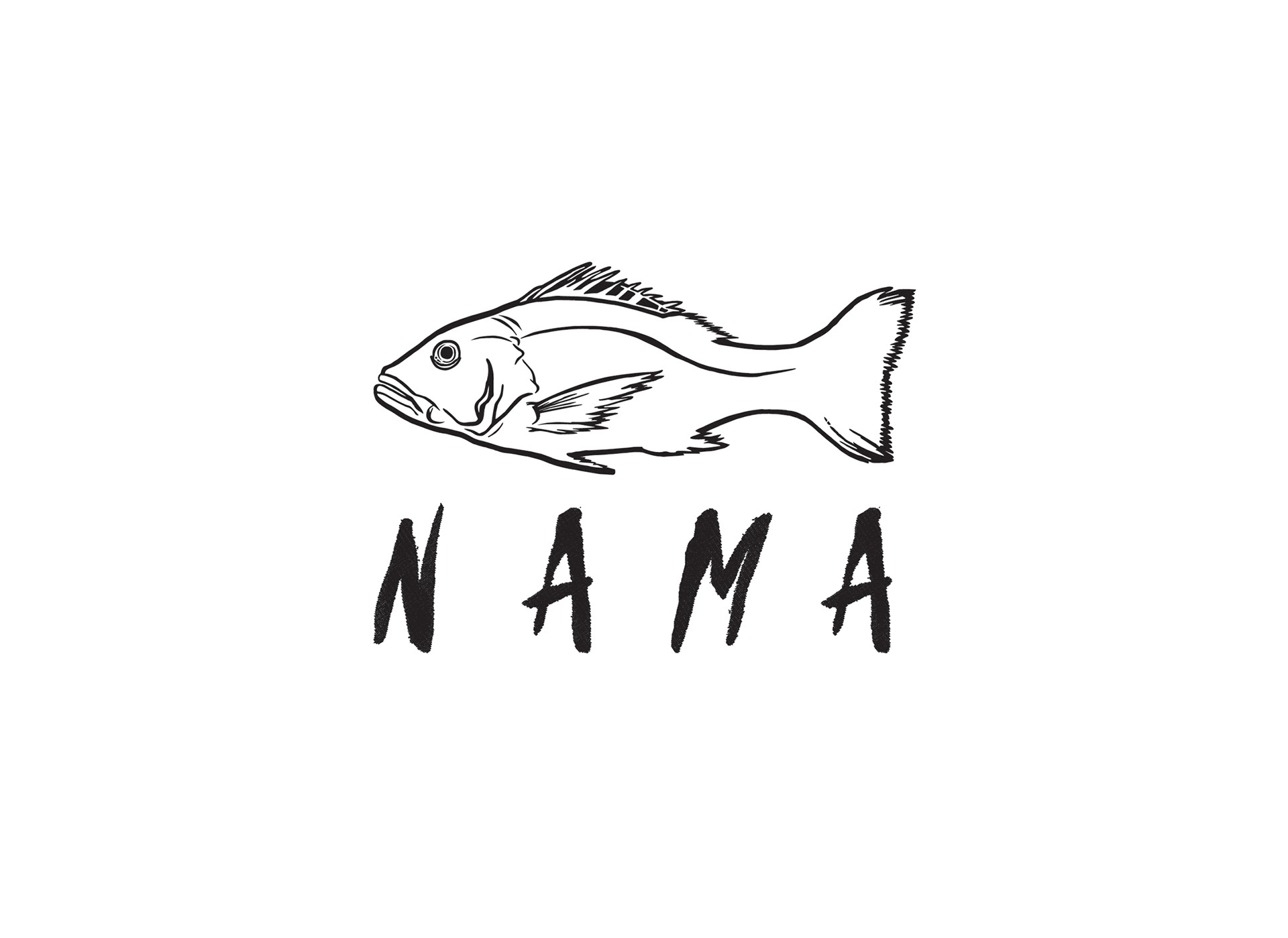
This sample branding project was a project of trial and error. I had the idea to create a logo that reflected the raw food served in a sushi restaurant. After some research, I came up with the name NAMA as this word means "raw" in Japanese. The logo is created from a linocut drawing of a red snapper fish (commonly used in sushi).
Sushi is one of my favorite foods, which I often see as individual little rolls of art. A food so divine begs to be unwrapped like a gift. This lead me to the concept of high-class packaging for high-end dining. Each box will have a hand-stamped red snapper across the top and will slide open to reveal your meal. The boxes can also be used to serve carry out orders.
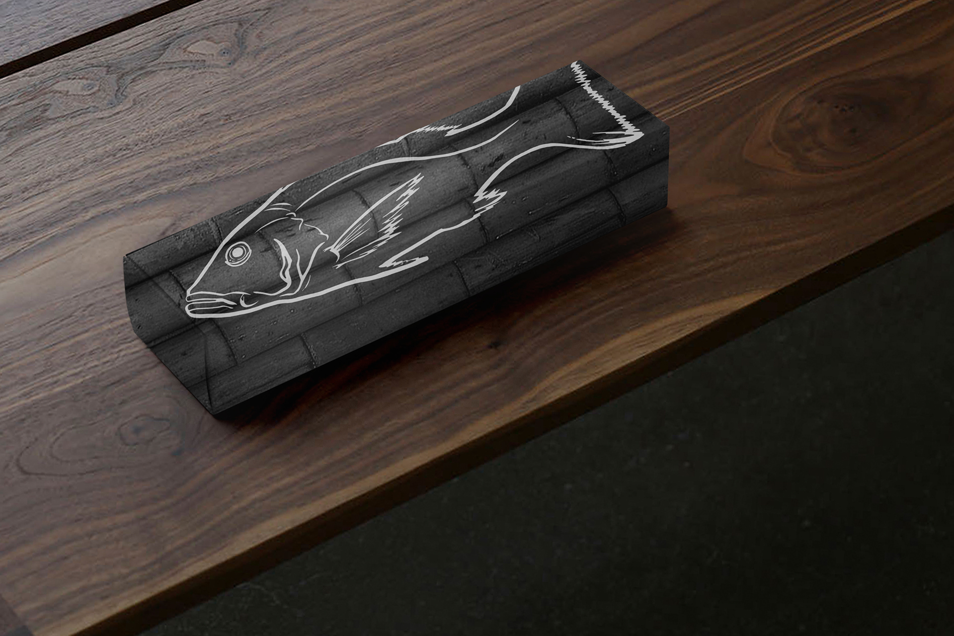
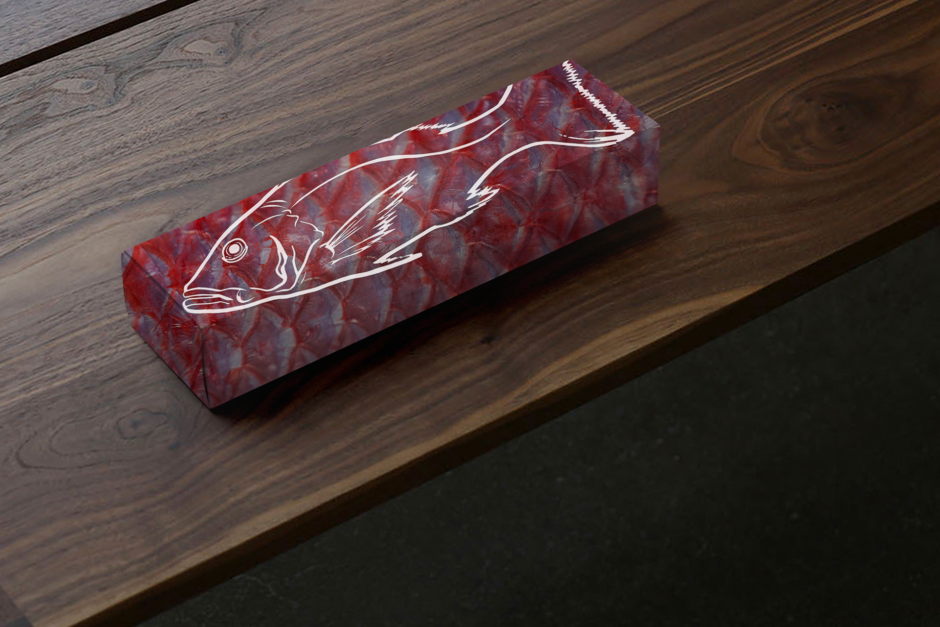

Pictured Above (Sample sushi box designs with applied textures from the concept's style guide)

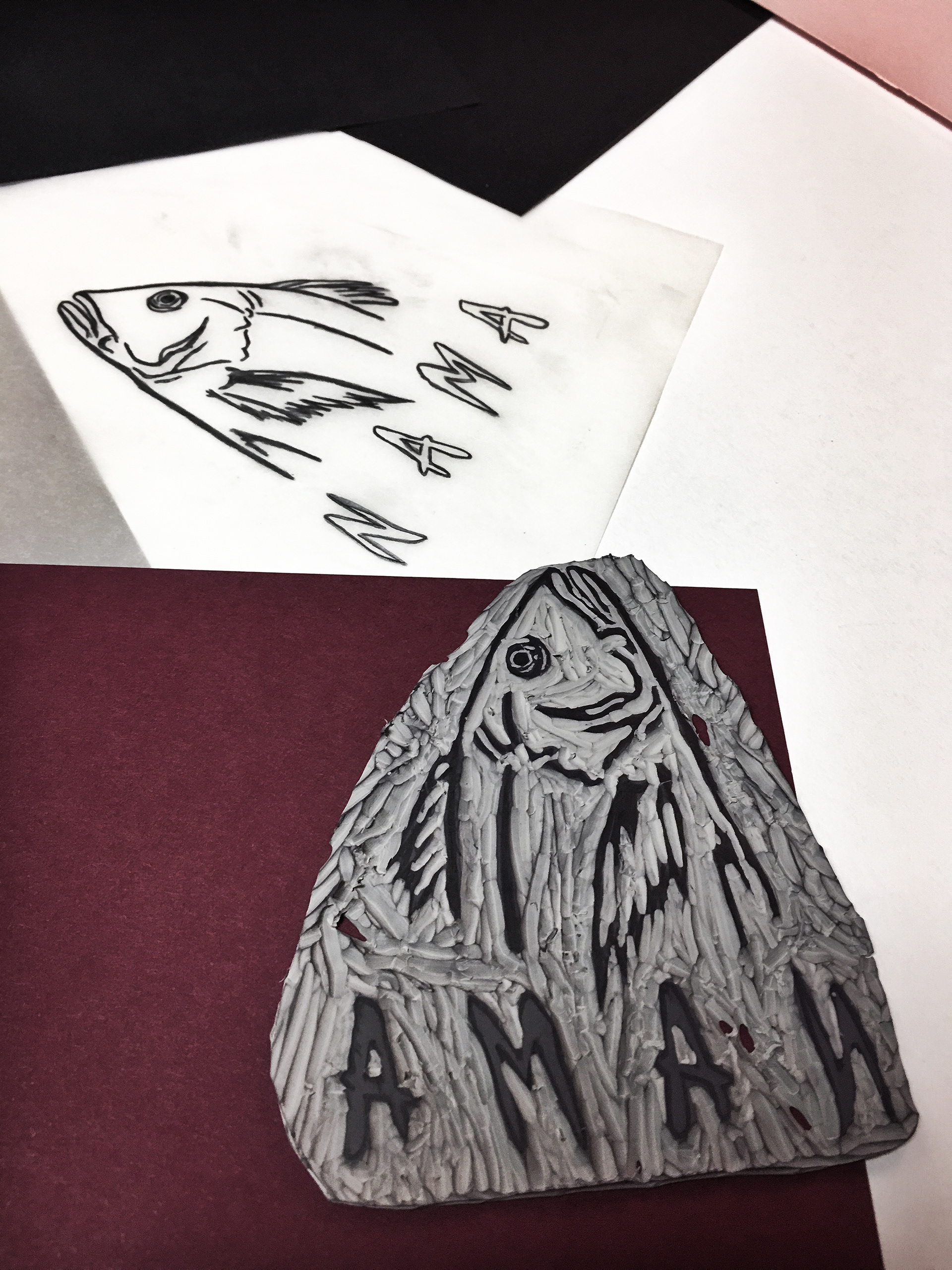
Pictured Above (A glimpse into my process of creating a hand-drawn linocut stamp)